Variables in the Configuration Asset
Every variable in this asset has a tooltip/description in blueprints. I will cover the only most important ones in this document. \
\
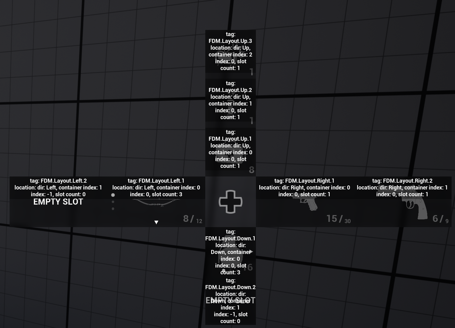
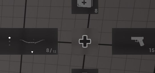
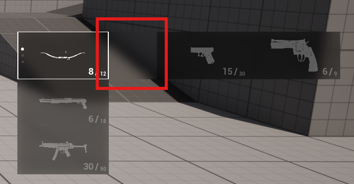
Layout Data (GameplayTag -> S_FDM_LayoutData)
Contains the layout configuration that maps layout tags to directions, container indices, and order.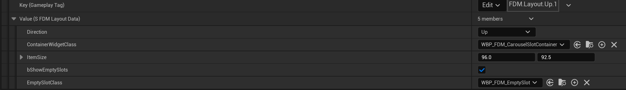
- Key (Gameplay Tag): Each Entry object also exposes a Gameplay Tag through its metadata (via an interface function), which determines which layout rule should be applied to that entry where it should be placed.
- Direction: This is the answer to the question “In which direction should entries with this tag be placed?”.
- Container Widget Class: As I’ll explain later in the documentation, I’m not adding a widget slot directly to the menu. I’m using a wrapper widget to store multiple slots in a container.
- Item Size: The size of widgets that will be displayed at this location. When a widget is added to this location, it is automatically wrapped in a size box (
WBP_FDM_CarouselSlotContainerdoes this). - Show Empty Slots: If enabled, if there is not any entry in this container, it spawns a widget from
EmptySlotsClass, otherwise the container will be hidden.
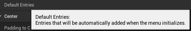
Default Entries
A list of entries that are automatically added to the menu during initialization. The given classes must implement theBPI_FDM_EntrySourceObject interface.This is mainly useful for prototyping, demo scenes, or static setups. In production gameplay, entries are typically added dynamically from inventory, abilities, or game state instead.
Auto Bind Navigation Mapping Context
For the system to recognize the navigation inputs, Navigation Mapping Context from the config file must be applied to player input. If you turn off this variable, you will need to call the “Bind Navigation Mapping Context” function withinAC_FDM_Component manually.
Padding to Center
Defines how far the first slot container in each direction is positioned away from the center.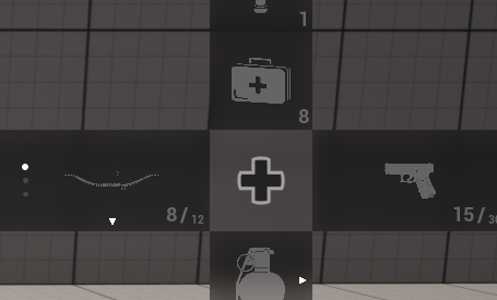
Padding to Center is 0 in this screenshot
Padding to Center is 50 in this screenshot
Hide Center Texture While Changing Slot
If enabled, the center cross texture is hidden when the slot-switching (expand / carousel) mode is active. \
\
Center Texture Direction Map
Allows assigning different center textures depending on the currently focused direction (Up, Down, Left, Right).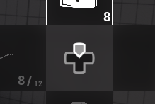
WBP_FDM_Widget > Refresh Center Image Direction function.
Cycled Container Changing
When enabled, navigating beyond the last container will wrap around to the first, creating cyclic navigation. In the animations below, I’m just pressing the “Select Up” button multiple times. Turned Off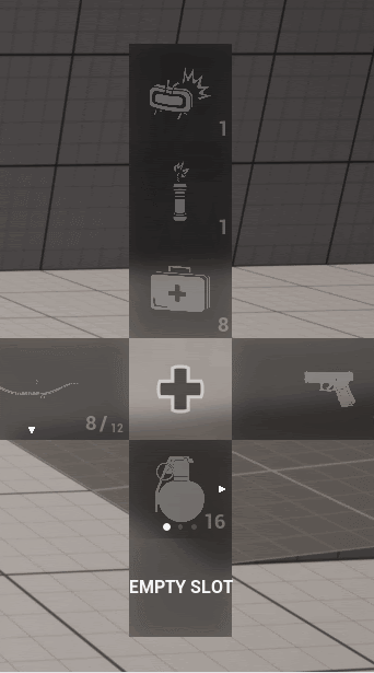
Use Debounced Selection & Debounce Duration in Seconds
Already explained in Debounce Mechanism section.Padding Between Containers
Controls the distance between multiple containers within the same direction group.\
Padding Between Slots
Defines the vertical or horizontal spacing between slots inside a container.\
Change Slot Widget
Defines the widget class used to display the “hold to change slot” UI when a container contains multiple entries.\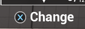
FlexibleDirectionalMenu/Widgets/ called WBP_FDM_ChangeSlotInputAction. You can modify this widget or you can create your own widget. It must implement the WBPI_FDM_SlotActionWidget.
Change Slot Hold Duration
Specifies how long the user must hold the input before the slot switching mode becomes active.Visibility Variables
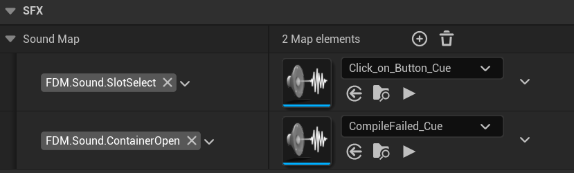
Explained in WBP_FDM_Widget > Visibility section.Sound Map
The publicPlay Menu Sound function plays the corresponding sound when a matching Gameplay Tag is provided; by default, example engine sounds are used when a slot is selected or a container opens.